Shopware Silver & extension partner
Certified Advanced Developers & solution architects
200+ E-commerce Rrojects
50+ Professional developers
Shopware Silver & extension partner
Certified Advanced Developers & solution architects
200+ E-commerce Rrojects
50+ Professional developers

Mobile devices have handled more than half of all e-commerce payments. This forced online businesses to give priority to UX designs that work well on mobile devices.
An online store needs a strong checkout page design to gain momentum. Knowing where to start or which characteristics are most crucial can frequently be challenging.

This article will assist you in creating a checkout page with the features your online store requires. We’ll go over the following subjects to assist you in doing this:

· Why should a checkout page be optimized?

· Best practices and optimization techniques for checkout pages
A checkout page is a page(s) on an e-commerce store which deals with payment and shipping/billing information. Customers can enter payment information and complete their orders on the checkout page.

Following information will be collected during the checkout process:

· A customer’s shipping information

· Billing information

· Shipping method and payment method

Working on your checkout page is a necessity. This includes optimizing it to be as fast, efficient, and frictionless as possible.

Creating a convenient, easy-to-use, and high-performing checkout will improve the purchasing experience for customers, lowering checkout abandonment and increasing conversions.
Checkout abandonment occurs when a customer abandons the payment process after starting it. It involves lost conversions. To capture this otherwise lost revenue, you should work on optimizing checkout. Analyze your data to learn why customers leave before checking out. From there you can optimize it, improve the user experience and increase sales.

Customers abandon checkout for a variety of reasons, but the following are some of the most common:

Adding unexpected costs or fees to the order summary causes customers to reconsider the value of their purchase. In some cases, these additional fees will cause the customer to reconsider.

Forcing users to register to proceed creates an impediment for customers who are ready to buy. Never obstruct checkout; Provide guest checkout options instead.

Complex checkout process while purchasing online. People expect and want a quick checkout. If the check Abandonment occurs as a result of a complicated checkout process. This checkout may take too long, require too much information, and is difficult to follow.

Minor performance issues, errors, and crashes might happen. But if you fail to provide an optimal user experience, expect a lack of trust in the payment process.

Lack of payment methods and shipping options: Retailers who are unable to provide unique shipping options as well as a variety of payment methods fail to provide the convenience that customers seek. Customers who can’t ship the item via their preferred courier or pay using their preferred method are less likely to complete the transaction.
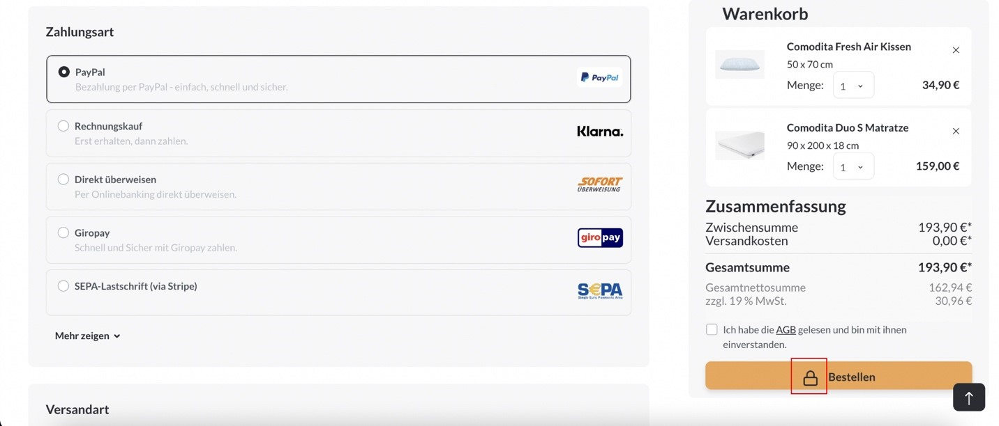
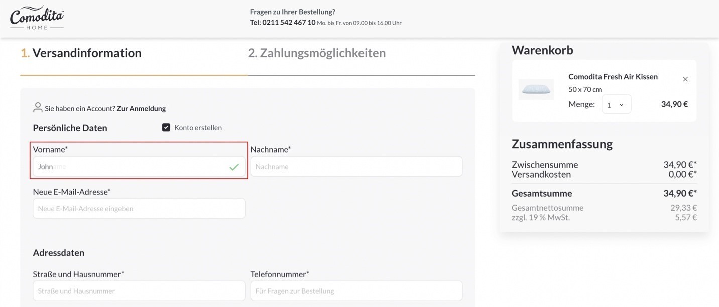
To avoid these issues, I will provide you with some tips on how to improve your UX/UI checkout design using our client Comodita Home as an example. Below you will find screenshots with clear instructions for a better understanding.

Following different strategies and guidelines are the best practices to ensure checkout pages run efficiently, effectively, and successfully.  This compilation includes the best tips and strategies to optimize your checkout page, reduce checkout abandonment and increase conversions. Remember: There is no one-size-fits-all solution. Your e-commerce store and experience are tailored to your brand and target audience.

For the best results, follow these key payment checkout page best practices:

1. Allow customers to check out: Never require customers to create an account or register before completing a purchase. It’s an inconvenience for customers to go through this one or multiple steps. It slows them down and eventually causes them to reconsider whether they want to proceed. Always provide guest checkout options so customers are not slowed down and can continue by simply providing their email address.

2. Provide a variety of payment options to customers and make sure to prioritize the major payment methods first. The more payment options customers have, the more likely they are to complete their purchase. Start with major providers to allow most customers to use a payment method, then expand as your business allows.
3. Prioritize a mobile-friendly design. Since 2018, more than half of all e-commerce payments have been completed through mobile devices. This fact compelled e-commerce retailers to prioritize mobile-friendly UX and design. When developing, designing, and optimizing your checkout, you must prioritize mobile-friendly design to ensure that the checkout is seamless for these users and consistent across all device types.

4. Displaying trust indicators and badges seals provides customers with a peace of mind prominently during the checkout process. Showcasing these throughout the checkout process gives customers confidence in the platform and provided security. Customers are unlikely to complete a purchase in your store if they do not believe their financial and personal information will be kept secure.

5. Use a progress bar that indicates where you are in the checkout process while also outlining the entire step process. It allows customers to see where they are in the process, how many steps remain, and an estimate time of how long the process will take.

It is especially true for multi-step and more complex checkout processes, but it also applies to some single-page checkouts. It organizes the process for customers and makes it easy to follow.

6. Use data validation and error notifications to reduce errors during checkout and obtain more accurate customer information. Add data validation and notifications for input errors to the checkout process. This feature ensures that customers enter data correctly, allowing you to validate details. It guides and simplifies the process of data entry for the customer.

7. Customers should not be surprised with additional costs added at the time of purchase. It makes them question the value of the purchase and whether they want and should proceed. Instead, provide as much information as possible upfront. Include shipping fees, taxes, and any other costs to inform customers of the total cost before proceeding to checkout.

8. Once you’ve identified common areas where assistance is required, add customer support options. Find the best resource for customers, whether it’s a knowledge base, a call center, or a live chat, and connect customers with support where they frequently encounter problems. This allows you to address these issues as they arise and keep your customers on track to purchase. A great way to handle this is to activate a chatbot to assist the customer when the user is inactive.

If you want to build your own web shop or have questions relating to e-commerce development platforms or apps, read our blog posts for Shopify and Shopware. Our dedicated outsourcing team can be your collaborator in e-commerce.